

I have designed three impactful artworks for iTherapeutics: a Pop-up banner, a brochure, and a square brochure. These designs aimed to promote the brand and highlight the benefits of choosing iTherapeutics, ultimately helping them to increase sales and build their reputation at industry conferences.
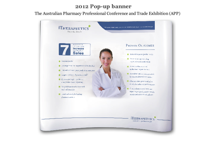
For the Pop-up banner, I carefully considered the client’s requirement to target pharmacists as the main audience and showcase the benefits of their products. The design incorporated a pharmacist character in the center, with proven outcomes and 7 reasons for choosing iTherapeutics displayed on either side. The elegant use of lines at the top and bottom of the banner ensured a sleek and professional finish.
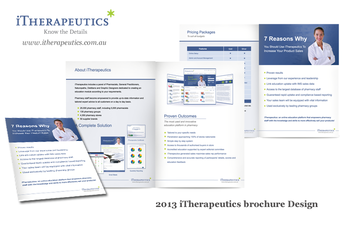
The brochure was created to provide detailed information on iTherapeutics and their services. I used a consistent design style, with a dark blue color scheme on pages 2 and 4, and white backgrounds on pages 1 and 3. This design ensured the brochure was both visually appealing and easy to read.
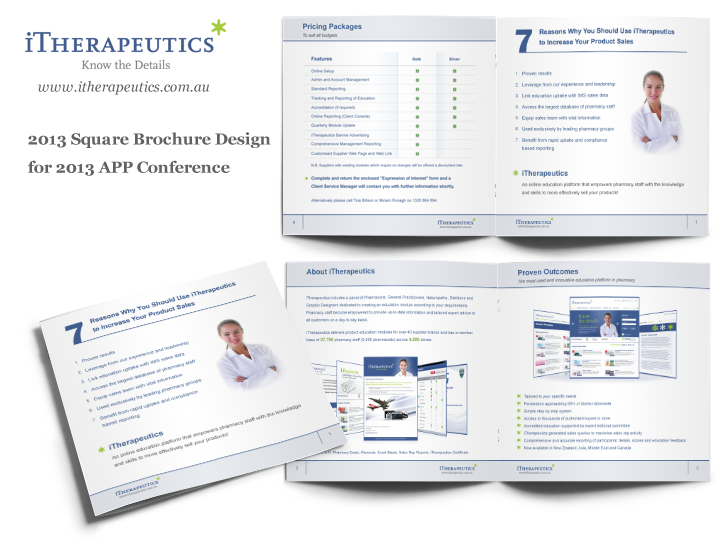
Designing the square brochure for the 2014 APP Conference presented a unique challenge. The client requested a flat but consistent design, building on the success of the 2013 brochure. To achieve this, I used the same header and footer lines, but opted for a white background for the content section. The result was a clear and neat design that effectively conveyed the necessary information.
Through my design work, iTherapeutics was able to effectively promote their brand and services, attracting potential customers and increasing sales.